

Various Works for the Kellogg Library
Branding, Marketing, Advertising, Web, Print
-Designing for a Wide Range of Subjects and Themes in a Short Amount of Time.
Overview
I had the opportunity to spend roughly nine months working at Cal State San Marcos's Kellogg Library. During my time library, I was working in a fast-paced environment built on tight deadlines while creating various forms of promotional material such as designing flyers, postcards, logos, T-shirts, and brochures in both a print and digital format.
Fun Facts
The Kellogg Library is 200,000 square feet, five floors, with 280,500 bound books and periodicals, including a children's section.
The library is named after Jean and W. Keith Kellogg II, who generously gifted $1 million to fund the library.
Other Details
I was also in charge of developing large campaign-based designs that carried a theme across several platforms over the course of several weeks. One of my largest and most time-consuming tasks creating a logo and various types of materials for the library’s 10th anniversary, which can be viewed here.
 |  |  |
|---|---|---|
 |  |  |
 |  |  |
 |  |  |
 |
Many CSUSM buildings have “digital signs,” which are large flat-screen TV’s positioned in student common areas. The Kellogg Library was fortunate enough to have two digital signs in the building. Digital signs featured important messages, upcoming events, and were a great advertising asset. Even though the digital signs were large, they were positioned up high and needed to be bold and have quick bits of information that could be read in under a minute before switching to the next topic.
I was tasked with regularly designing media to be displayed on the digital signs on the main floor. When I was tasked with designing for upcoming events, a digital sign was just one of the things that were included as part of a larger campaign.

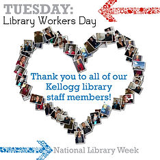


As part of National Library Week, I created a series of Facebook posts that were similar in design and concept to span the entire week. Each library was able to choose how they wanted to highlight each day's event. Because these were posted on Facebook they had to be eye-catching and provide a quick burst of information.
Monday, Challenged books: To highlight this theme I used the Kellogg Library’s data of “challenged” books. Tuesday, Library Workers Day: Because the previous days post was text heavy, I wanted to do a subtle design. Using staff photographs I shaped them into a heart and accompanied it with a short message in the center. Wednesday, Bookmobile Day: Although the Kellogg Library is located in San Marcos, a large majority of the people who use the services of the library are commuters from various areas of San Diego County. I chose to highlight information on the San Diego Bookmobiles, which many of our patrons probably have seen around town. Thursday, Teen Literature Day: Because Teen Lit Day fell on a Thursday, I choose to go with a throwback Thursday concept and highlight books that are commonly read during middle school or high school.

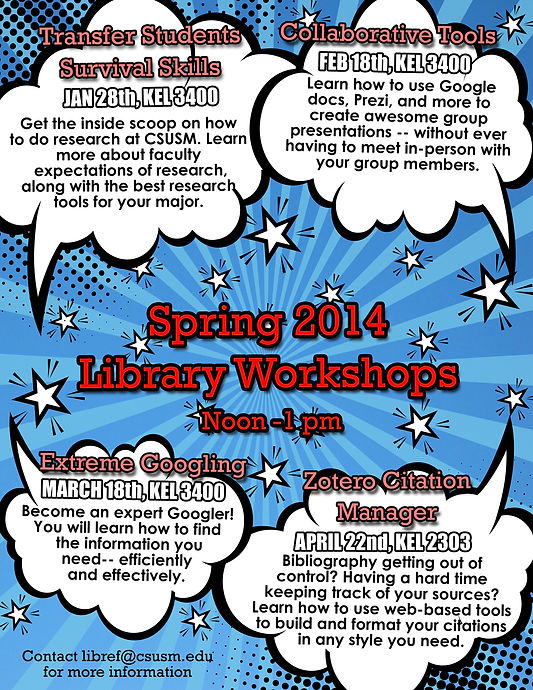
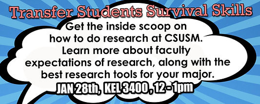

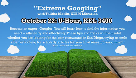

Each semester the Kellogg Library holds a series of free classes that highlight various informational topics meant to help students better succeeded on a college campus. The classes are the same every semester, making it extremely important that the design themes were different each semester so that students wouldn’t just assume that the classes had already finished.
For Spring 2014, I went with a comic book look that was meant to be an eye catcher when printed and distributed across campus and in email notifications, and also on the library’s digital signs and website. For Fall 2013, I went with a nature-Esq theme that was meant to be bright and fun.


The Kellogg library also had a free standing gallery space that was used by students, faculty, and the San Marcos community members to feature various types of artwork or art based projects. I was in charge of developing branding and marketing for these gallery events that had a clean balance with the works provided. I also assisted with setting up, maintaining, and then the takedown of various artworks in this gallery-like setting.
These are printed postcard/mailers that I had the privilege to design and hand out. The Uterus Flag Project was Spring 2013 and Enlisting a Nation was for Fall of 2014.